MGM Springfield: The Impact of Experiential Retail on the Main Street Corridor

“MGM is seamlessly integrating its stunning experience into the fabric of an historic city. The community’s character is honored by sensitive design and its experience is enhanced through open-air “place-making”. At inception, Form + Place was tasked to respect the DNA of MGM Resorts International, while reviving the energy and charm of Springfield’s long-treasured Main Street. The result is an urban master plan that blends old and new into a remarkable New England destination.” – Chuck Irving, Davenport Companies

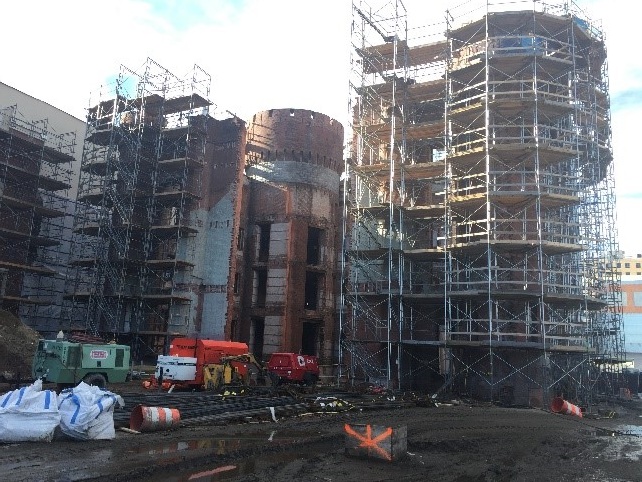
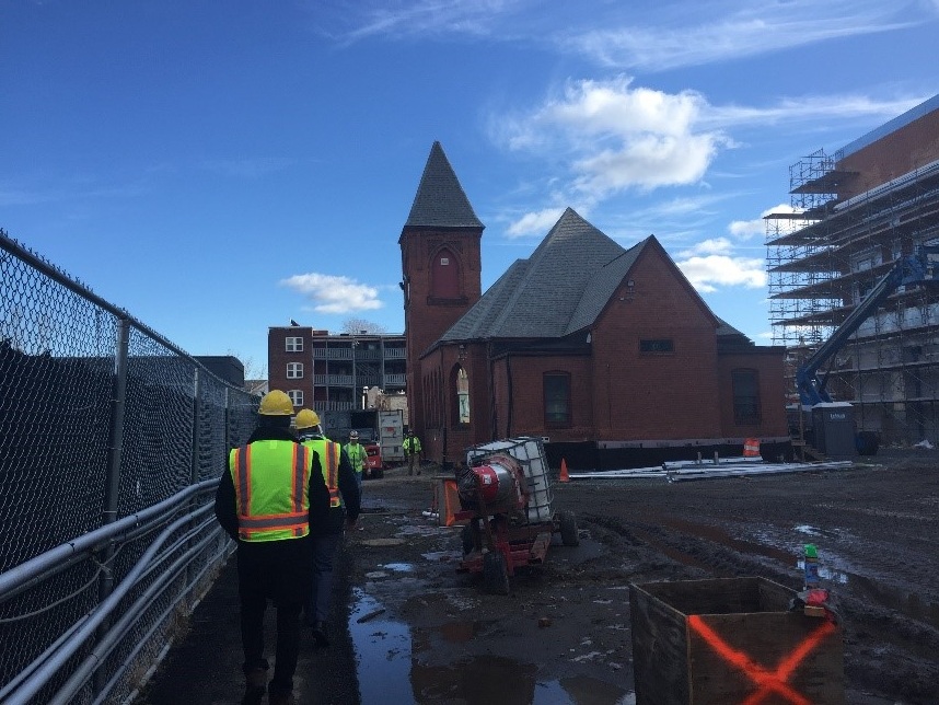
Construction Photos from mid-January 2018

Construction Photos from mid-January 2018

With total construction costs anticipated to be $900 million, the MGM Springfield project is nearing completion, and is scheduled to open in the Fall of 2018. The project has certainly evolved from early conceptual design studies in 2012, with the signature 25-story hotel tower morphing into a more integrated low-rise building, designed to provide a higher level of definition to the Main Street corridor. The fundamental vision, however, to create a catalyzing urban mixed-use destination with entertainment, experiential retail, restaurants and, of course, a casino, has remained consistent.

 
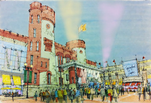
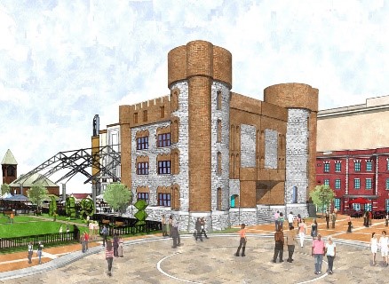
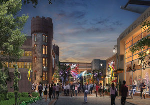
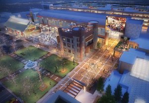
Early F+P study of the Armory retail and entertainment complex

Early F+P study of the Armory retail and entertainment complex


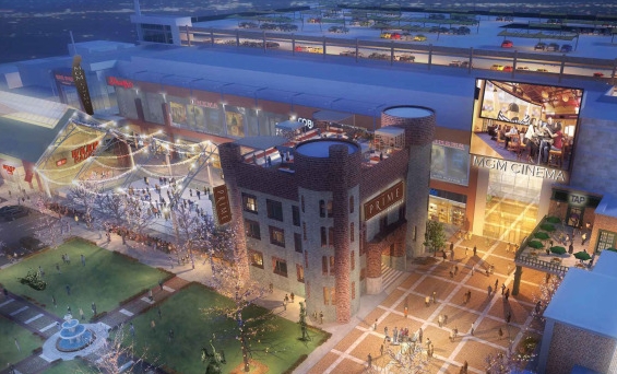
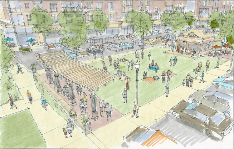
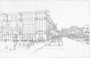
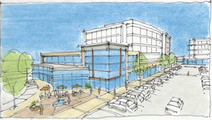
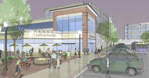
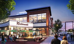
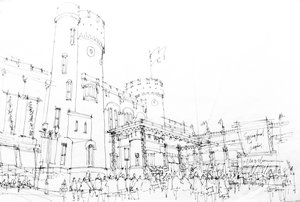
Working with MGM and Davenport Companies, Form + Place’s initial urban diagrams put forward the idea to turn the retail and entertainment component of the casino outward to engage the downtown. While casino retail leasing is traditionally introverted - oriented towards patrons on the gambling floor - it was posited that flipping this focus outward would reiterate the desire to connect with the larger community and to help stimulate economic development along the Main Street corridor. At the heart of the retail and entertainment experience is the concert venue / skating rink which, using the historic Armory building as a backdrop, will provide publicly accessible space with daily programming. The entertainment options will also include an 8-lane bowling alley, a 35,000 sf cinema with 8 screens, several restaurant/pub concepts and a diverse compliment of local and national retail tenants.

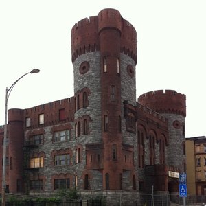
From a “placemaking” perspective, this experience will be uniquely Springfield. The Armory building, portions of which were damaged during the 2011 tornado, is being refurbished and, together with the 130 year old First Spiritualist Church, which was relocated to the site, represents a thoughtful preservation of Springfield’s architectural history. The church will become the home of Kringle Candle, which will bring its uniquely New England brand to the project. Historic themes will be reinforced throughout the interior and exterior of the casino, with Springfield’s heritage celebrated through the use of industrial materials, the incorporation of artifacts from the Springfield Museums and tributes to famous locals such as Dr. Seuss, who was born and raised on the site.


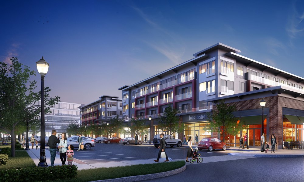
It will be interesting to track the impact of the casino development on future economic development in downtown Springfield. Currently, there are plans to renovate the historic Court Square Hotel building into an apartment complex, which will fulfill MGM’s obligation to provide 54 market rate units. And diagonally across Main Street from the casino, Form + Place helped master plan another exciting new development called Davenport Square. Designed to be synergistic with MGM’s outdoor plaza, Davenport Square will be a mixed-use, Main Street project programmed for retail, restaurants, medical offices and daycare. In addition to these projects, numerous feasibility studies have been done over the past 6-7 years to imagine the repositioning potential of other properties along the Main Street corridor, as far down as Tower Square. Understanding which uses and vendors will ultimately be targeted won’t become clear until MGM announces the full complement of its retail and entertainment tenants this Spring.

 
Main Street Corridor, Springfield, MA

Main Street Corridor, Springfield, MA


The Value of Hand Drawing in The Age of Computer Visualization

“Drawings of eyelevel and interior views…tend to show an environment with a warmth, subtlety, and humanity not present in model photographs or computer-generated images.” Paul Stevenson Oles, AIA

Today, architects and planners frequently use volumetric computer modeling from the outset as an integrated design tool.  Visualization firms like NeoScape, Tangram 3DS, TiltPixel and others can use these models to create incredible photo-real renderings, which have broad appeal.  At Form + Place, in addition to using these tools, we believe that hand drawing plays an integral role in the visioning process. 

A while back when I was studying architecture at RISD, I helped teach the Perspective Drawing class. This was before computers became ubiquitous in the architectural design process. Creating “3D constructed perspectives” of projects was a matter of first creating plans, sections and elevations of the building, and then, painstakingly creating the rendering through a process of establishing a view point, a horizon line, a picture plane and then projecting the image manually onto the picture plain with a very long ruler. It was time consuming and if you messed up… there was no easy way of editing the rendering in process. While computers have given us a new range of efficient visualization tools, we have found that the drawing process is still quite valuable both for evolving the design and creating final presentation renderings that convey a narrative that more closely reflects our clients’ goals and values.  They invite the client to participate in the process, rather than suggesting that a design has been finalized.

As plan and program concepts for a project evolve, we simultaneously model the most basic massing characteristics of the buildings and public realm (usually in Google Sketch-Up) to create an approach to architectural style and placemaking. In an iterative process between sketching and computer modeling, the visual characteristics of a project emerge. In the world of private commercial development our clients need to visualize the project early-on in the process to consider how they might begin to discuss it in the community and with potential tenants and partners. Sometimes, like on the Dascomb Road Project, an interim stage of mixing hand-drawn vignettes with computer model exports allows for an efficient, affordable way of testing the design in public, while presenting a project that is clearly still in process as the client solicits community input.

When Form + Place created the public realm retail concept for MGM Springfield, there were a series of existing buildings on the site that could not be removed and would need to be integrated into the design of the future mixed-use gaming and entertainment venue. One of these buildings was the existing armory, the rear portion of which was damaged by the tornado of 2011, and subsequently demolished. The front castle-like façade of the armory, however, is somewhat magical in its fanciful architecture. Creating an image that cast the building as the backdrop to a concert stage in an open-air setting was key to MGM visualizing the casino and entertainment uses engaging the surrounding streets, and creating a new neighborhood, rather than an inward-looking gaming destination.

The Winthrop Center Business District master plan involved another type of visioning exercise that called for a softer approach to image making and urban visioning. While the MGM exercise was used as a quick spark to catalyze a new development model for a seasoned commercial entertainment company, the images we generated for Winthrop were intended for the general public, and were used to convey the variety of opportunities that were possible in the Center Business District. To that end, the more accessible approach of free-hand renderings, occasionally complimented by shots of a computer model, was a method that helped bring the community into the dialogue, allowing them to contribute to the process of early idea generation about the future of their city.

In the end, whether it’s a hand-drawn sketch merged with a digital export that is then augmented in Photoshop, or an ink and marker vignette sketched over a photo, we are committed to the process of story-telling and communicating ideas. We’ve found that our process is most successful when our clients are engaged early on, often with the aid of hand drawing, which in turn fosters a mutual interest in seeing our projects brought to life.


Needham Street in Newton – Evolving from Strip to Street

“for a walk to be favored, it has to satisfy four main conditions: it must be useful, safe, comfortable and interesting” - Walkable City by Jeff Speck

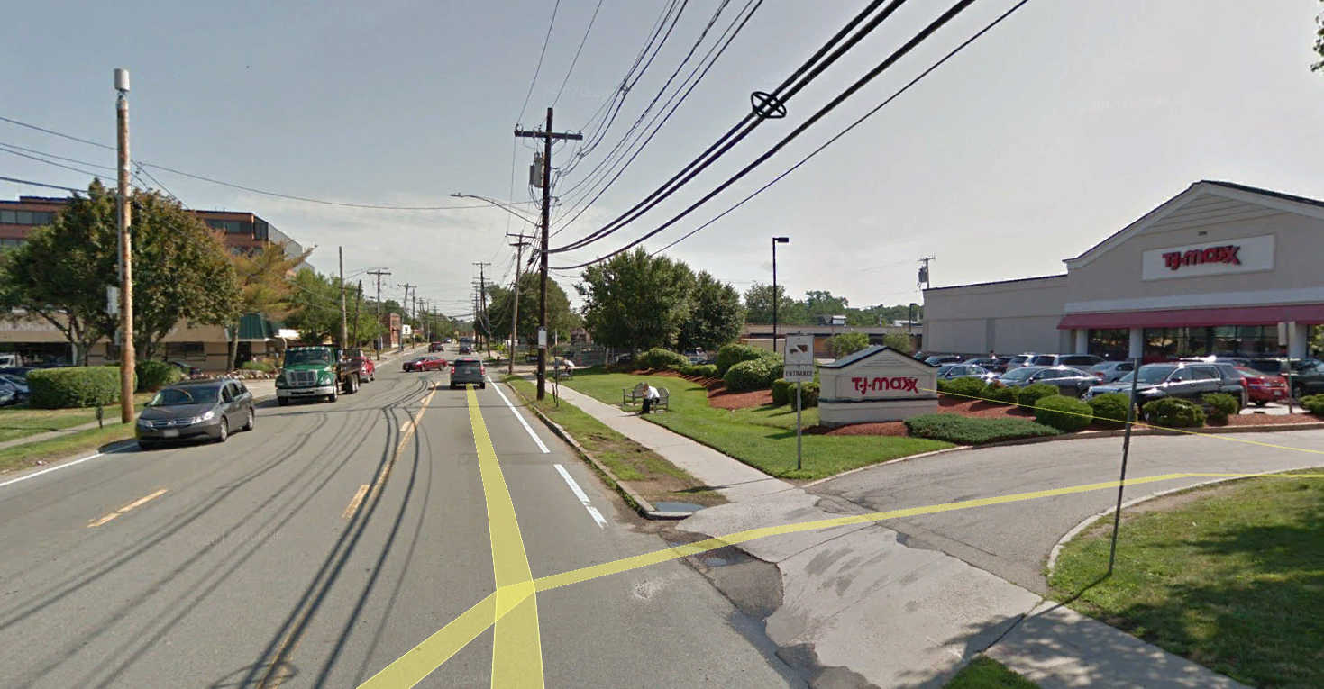
If you’ve occasionally driven down Needham Street in Newton over the course of the last few years, you’ve witnessed the start of a metamorphosis. This commercial strip has been historically characterized by isolated retailers and a hodgepodge of office buildings and light manufacturing. But over the course of the last decade the consolidation of certain parcels and the general pressure to develop land for maximum return on investment has fostered an opportunity whereby Needham Street could evolve from a classic commercial strip into a genuine walkable and vibrant street.

Needham+Street+Diagram+1.jpg

As an urban planning diagram, the Needham Street environs is confounding. While it stretches enviably between route 9 and route 95 and the Green Line, an overlay of major arteries and nodes shows that the connection points are constricted, strained or just incomplete. While most of these can be overcome with time and thoughtful planning, it is heartening that the impetus of the evolution of Needham Street stems from the people who shop, work and reside in this area, and who are demanding more from the settings that they live, work and shop in. Thankfully that demand is trickling up to today’s savvy developers who are responding with projects that value placemaking as an essential design objective.

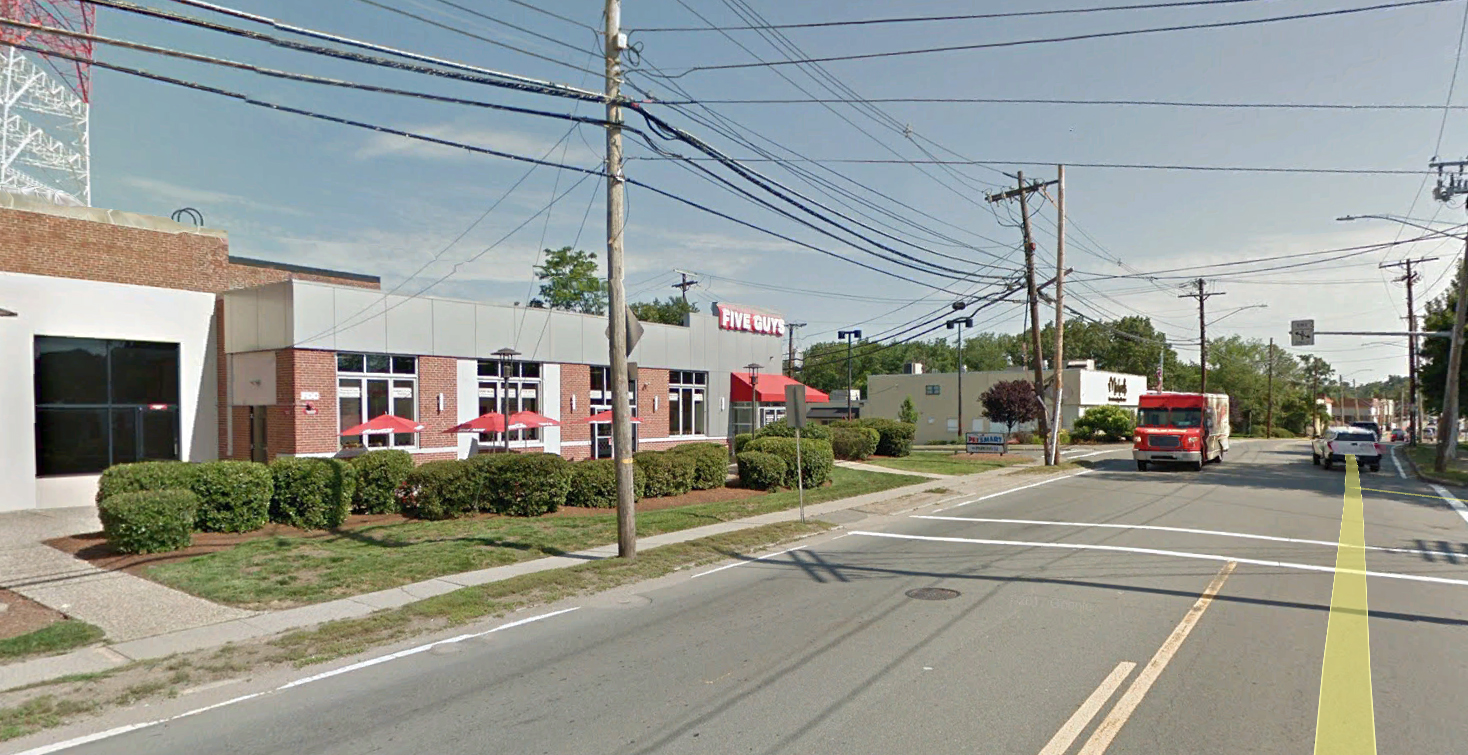
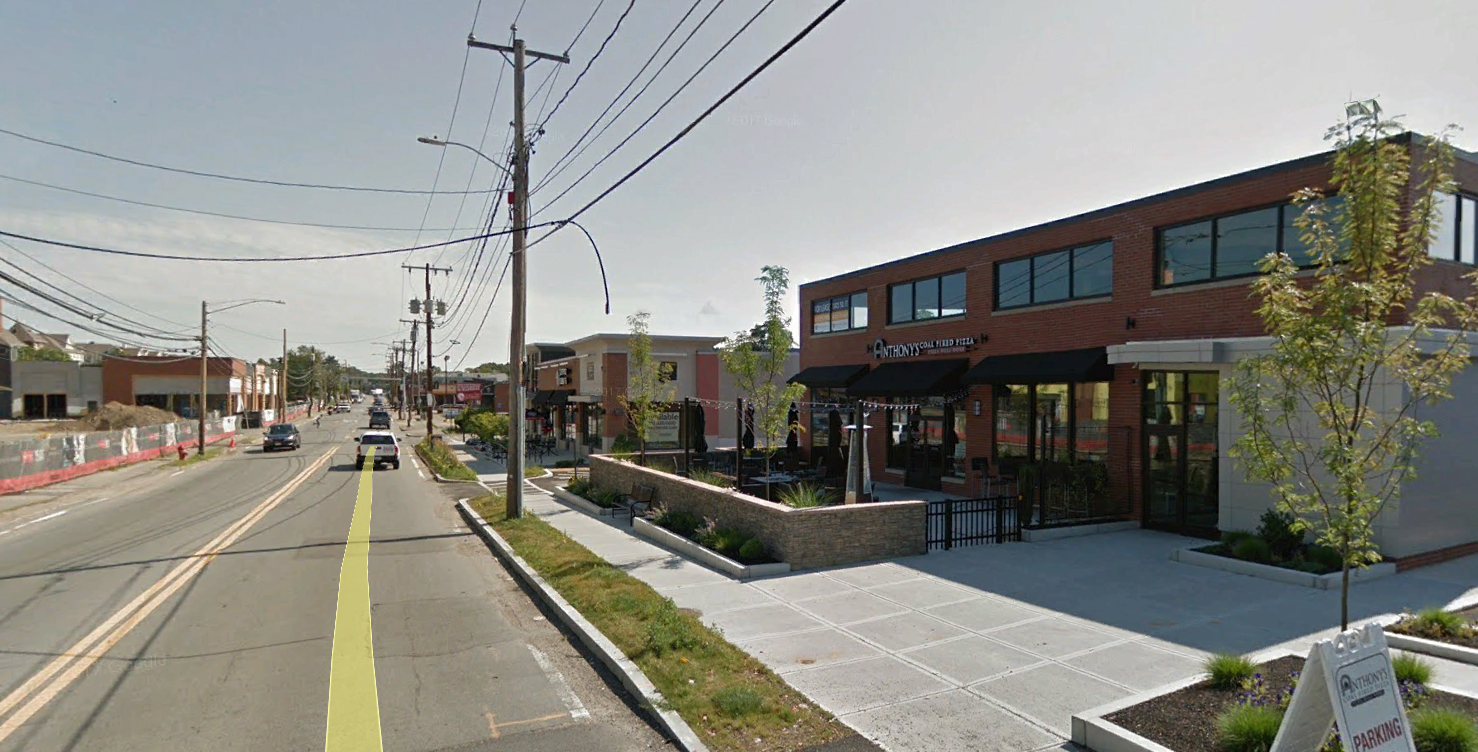
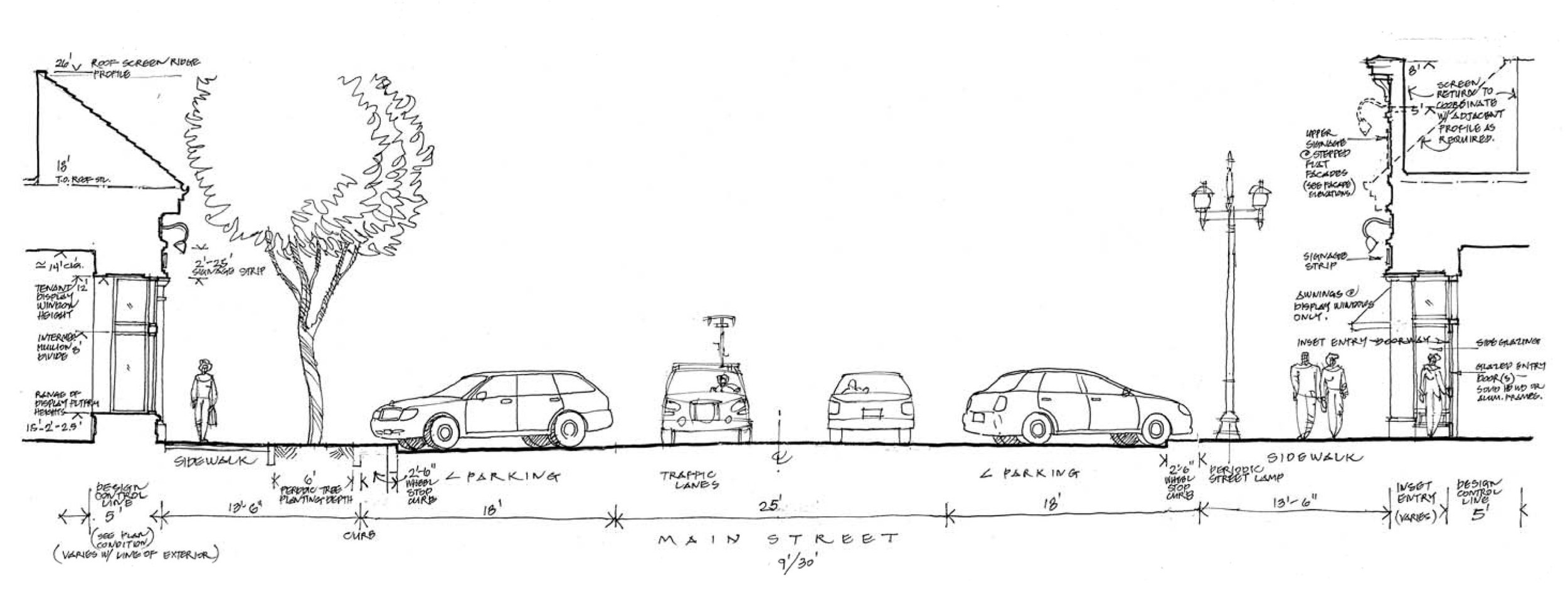
There is probably nothing more antithetical to placemaking than large swaths of lawn separating the sidewalk from buildings that crave and need street engagement. This was more or less the norm on Needham street until recently when the developers of projects like Needham Street Village Shops (Bierbrier Development Inc.), 170 Needham Street (The Growth Companies), 180 Needham Street (Crosspoint Associates, Inc.), and now the Newton Nexus (also by Crosspoint) put forth proposals that engage the sidewalk directly with building mass, outdoor dining and landscaping that focuses on inviting patrons rather than buffering fast moving cars. The result is a street section that creates a contained, walkable outdoor room such as one finds in good cities and towns. Walnut Street in Newtonville makes a good comparison as it is both a major thoroughfare, and also a village center.

Street Cross Section - Gateway Commons, East Lyme, CT

Street Cross Section - Gateway Commons, East Lyme, CT

Wayland Town Center - Wayland, MA

Wayland Town Center - Wayland, MA

Walnut Street - Newtonville, MA

Walnut Street - Newtonville, MA

The evolution of Needham Street into a place rather than just a drive by strip will depend on not just engaging, street-focused site design, but also the development of high density housing options. Avalon at Newton Highlands started that ball rolling several years ago. It seemed a pretty perplexing development at the time, but now as the neighborhood evolves, it seems like Avalon was ahead of the curve in seeing the underlying potential in Needham Street. This hasn’t been lost on Northland Development which has proposed the biggest plans unveiled yet. Their 30-acre masterplan for the Oak Street spur off of Needham Street proposes to bring 950 new units of housing and seems to genuinely embrace the walkable neighborhood concept.

Northland Development's proposal for Needham Street and Oak Street

Northland Development's proposal for Needham Street and Oak Street

Through the latest economic cycle great progress has been made to raise the quality of the environment as part of the ongoing development boom. Time will tell if good planning and an aggregate of projects that embrace the value of engaging the street edge can stitch together Needham Street as a cohesive, walkable whole.

Westford Valley Marketplace – Experiencing Community in Today’s Shopping Places

“Yes, technology has changed the way people shop. But it will never match the feeling of real-life experiences and sense of community. People will always want to get out, feel good about their surroundings, and to connect with the world beyond an inanimate, one-dimensional screen.” – Andy LaGrega, Principal, The Wilder Companies

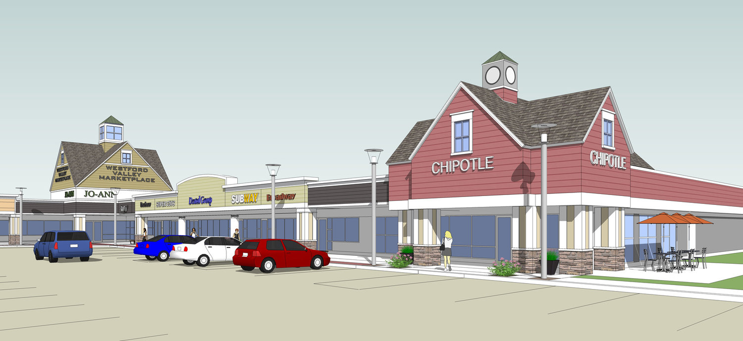
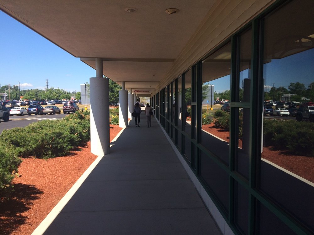
Like many of our clients, Andy LaGrega believes whole heartedly that to stay relevant in the retail game, developers have to offer experiences and amenities that speak to the idea of community engagement. That can be a tall order when repositioning an existing retail strip center, especially if it has a continuous arcade, little or no public space amenities, and is generally outdated in its architectural style. Westford Valley Marketplace is very typical of strip centers of its vintage, but along with being newly anchored by a Whole Foods Market, it is being renovated to address three critical design elements in these types of centers.

Curb Appeal in Approach and Orientation:

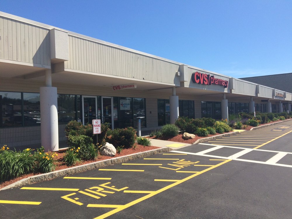
As one arrives at Westford Valley, the presentation of the existing building facade is a somewhat grim, grey monotonous band at the outer edge of a continuous arcade. The façade provides little or no retailer identity, but it is punctuated occasionally by gable end roof forms. These elements provided an opportunity for the project team to develop a composition of forms that engage shoppers as they enter the center and group tenant signage on distinguishing architectural elements. The roof forms additionally allowed the team to establish a more traditional New England vernacular style throughout the center.

Overcoming the drawbacks of the arcade:

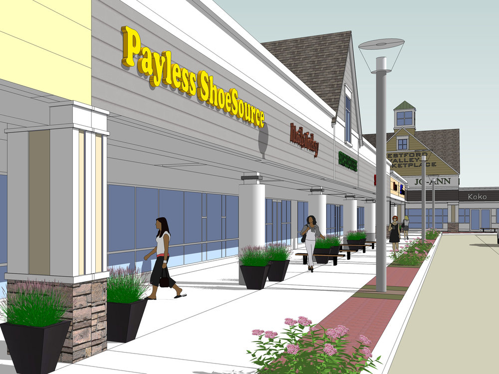
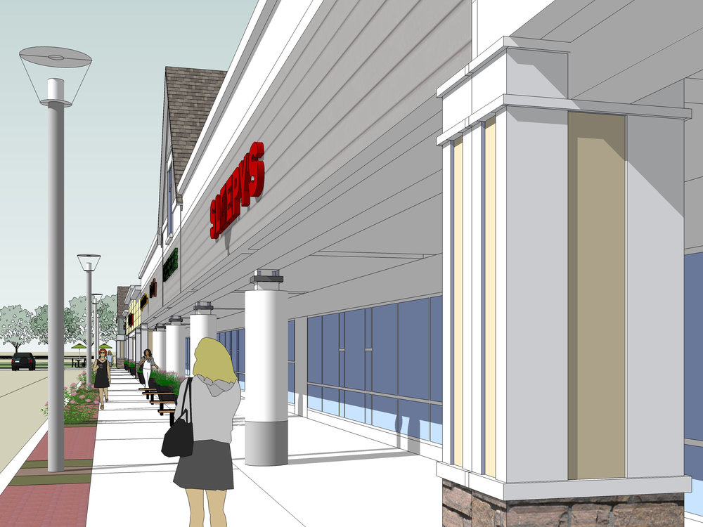
The arcaded retail strip center is a building type that we are often asked to help reposition by our clients. It derives from an outdated assumption that you had to protect shoppers from the weather to get them to come out and spend money. In today’s market it’s been proven that patrons prefer an environment that is more “open air”… as long as there are engaging reasons to stay a while and visit multiple venues. Since it is often too expensive to tear down the arcades and rebuild new facades in their place, creative ways of rebranding the outer façade and softening the arcade itself with updated lighting, signage, and finishes is critical in these efforts. While wrapping existing steel pipe or concrete columns with new masonry or other finishes may seem intuitive, arcade columns often compromise sight lines to tenant storefront, so care needs to be given to how it is done and how often.

160715_ICSC_4+-+Copy+-+Copy.jpg

Making the best of open space opportunities:

At Westford Valley Marketplace a zone of shrubs was originally planted at the outer edge of the Arcade. This zone now provides an opportunity to create an area that is a tenant and patron amenity as well as a real community benefit. By combining hard and soft landscape elements along with new lighting, seating and other outdoor furniture, an active zone of programmable public space can be created along the front of the entire center. Café and other food tenants can spill out onto these enlarged sidewalk areas to engage shoppers and create a sense of place and desire to linger longer. Like all our successful clients, The Wilder Companies runs active programming campaigns, communicated through social media and other outlets, that help to bring out shoppers for unique community retailing events. Small open spaces that provide areas for sidewalk activity are perfect places for these kinds of events to occur, and support the sense of community that is so critical to the success of today’s retail centers. 

Wayland Town Center: The Complexities of Phasing in a Master Plan

2017 Master Plan and Google Aerial

2017 Master Plan and Google Aerial

It has been 13 years since the master plan for the Wayland Town Center project was first conceived, and the project is slowly taking shape, having weathered some difficult economic times. It is always interesting to see a “vision” come to life and witness the challenges presented at each phase of a project’s evolution. In Wayland, one of the biggest issues from a place-making perspective was that, for an extended period of time, there was only one side of “Main Street” completed. So, for a project that was built around a fundamental Town Center principle of creating a lively pedestrian shopping street, it’s signature experience was not fully intact.

 
Wayland_4.jpg
 

Today, the second side of the street has taken form and, while there are still quite a few leases to fill, there are moments that make for quite an enjoyable environment. The devil is always in the details, however, and master-plan visions such as this are always most successful when they are paired with carefully considered architectural and site design guidelines. In working with KGI Properties and The Congress Group to help facilitate the Town’s acceptance of a new Mixed-Use Overlay District on this former Raytheon site, it became clear that the integration of guidelines would be critical to ensuring that the scale and level of articulation of the project would be realized successfully.

Wayland_Images-2.jpg

This attention to detail can be seen in many places in the Town Center such as in the quality of the streetscapes that have paving, lighting, signage, landscaping and urban furniture that all contribute positively to defining a walkable environment. In addition, the use of pedestrian mews to connect parking areas behind the buildings to the main shopping street is very effective. These mews were purposefully designed to have storefronts that wrap the corner. While there are some sections of these passageways that are compromised by collections of meters and utility boxes that have not been effectively screened, they remain important connectors in the center. There is a pedestrian connection that was eliminated on the north side of the street, presumably to accommodate the Ace Home & Design store, and even this subtle variation from the master plan has an impact on the quality of the pedestrian environment in this area.

Wayland_Images-3.jpg

In general, the architecture of the “Main Street” environment is quite successful. Retail storefronts are detailed to closely follow design guidelines that were based on a New England vernacular found in neighboring village centers such as Concord. While there is not as high a level of architectural detail on the rear facades of the buildings, facing the parking fields, there is an adequate level of visual interest incorporated. This was deemed critical to the quality of the environment since it was anticipated that buildings would be approached from multiple sides. There are a few areas where faux second floors are revealed by truncated roofscapes and cornices, but the buildings do, by and large, maintain a well-conceived scale and sense of completeness.

 
IMG_8260.jpg
 

A few areas in the Town Center feel as though they have come up a little short of the original vision but, there is still time and the hope that future phases combined with a more complete leasing environment will make the project feel more holistic. The public green, which does host concerts, has some unexpected landscaped berms that effectively cut it off visually from the rest of the shopping environment and limit its suitability for the full range of active uses. In addition, the housing along the northern edge of the green does not have the presence that was originally envisioned and fails to provide adequate definition to the space. This may be remedied to some degree once the civic building slated for the head of the green is developed, helping to complete the mixed-use equation.

Wayland_Images-4.jpg

The Stop & Shop that anchors the east end of the project is fronted by a large parking field that, while certainly mandated by the lease, lacks the quality landscaping one would expect in a town center environment. The impact of this nondescript parking area is exasperated by the fact that adjacent to the Stop & Shop there is a key retail block that remains unbuilt along the project’s main spine. Building a small retail pavilion on this parcel would help buffer the parking world from the pedestrian shopping street. As anticipated, the incorporation of larger format stores, together with their parking and loading requirements, into a pedestrian-scaled town center environment demands careful execution.


The developers have certainly faced some unanticipated challenges, including the reduced availability of waste treatment capacity, which has limited their ability to incorporate the desired mix of restaurant uses. But, all in all, it does feel as though Wayland has embraced its new Town Center and that this is due, to a large degree, to the quality placemaking framed in the original master-plan.