Updating a Local Retail Icon; The Barn Family Shoe Store Gets New Digs

New Neighborhood / New Look / Same Great Family Business

By John Rufo

Do you know someone who grew up in Newton? Or maybe Waltham or Watertown or Brighton? If you ask them, they probably have a story about The Barn Family Shoe Store, known to all as simply, The Barn. That’s where you went to get your shoes. It was big, it was homey and no frills, and in recent decades, as shoe retailing became dominated by stores like DSW, The Barn was a place to go and get advice from people who really knew shoes, welcomed families, and were glad to see you. If you valued your feet and the shoes you wore, it was a must visit kind of place.

 
The Barn in it’s original location

The Barn in it’s original location


The Barn (up until recently) occupied a campus of sorts, spread between two sprawling buildings set back from Washington Street in West Newton. When Form + Place was engaged in 2018 by The Barn to test fit and program a potential space at a new development in Newtonville, the shoe retailer could conservatively hold up to 45,000 pairs of shoes with room to spare in the existing warehouse style buildings. The salesfloor, while quaint and unpretentious, was badly in need of a makeover to catch up with current retailing trends and to provide the kind of shopping environment that customers, especially new customers, look for and expect.

 
Inside the original Barn Family Shoe Store

Inside the original Barn Family Shoe Store


In test fitting The Barn’s operation for a new location, there were two main design problems to solve. First, how to maximize inventory in the new space, and second, how to make it new while keeping it The Barn. The store was also going through a generational change in family ownership. The opportunity, therefore, to evolve the brand through contemporary interior design was identified as a critical aspect of this transition.

A variety of stock areas in the old West Newton location

A variety of stock areas in the old West Newton location

Starting with the back of house, existing stock areas of the old facility, with under-utilized space and outdated stock aisles, would need to make way for a more efficient use of space in the smaller future footprint, while at the same time meeting new building codes and accessibility imperatives.

Sales floor stock, storage and display fixtures in the new store at Trio Newton

Sales floor stock, storage and display fixtures in the new store at Trio Newton

With a smaller footprint for both salesfloor and stockroom areas, making use of the high ceilings in the new space at Trio Newton was critical in maximizing instore inventory. The design called for wall-mounted storage and display fixtures at all perimeter walls, with moveable ladders to access high storage fixtures, slatwall for out-of-box displays, and adjustable low shelves for flexible box storage.

Salesfloor aisles defined with moveable display fixtures, contemporary materials and lighting

Salesfloor aisles defined with moveable display fixtures, contemporary materials and lighting

The overall experience of the new store is warm, calming, and spacious.  The simplified interiors and up-to-date moveable display and stock fixtures give the space a transformable and flexible advantage as well as the opportunity to evolve as shoe retailing continues to change. The materials palette is understated, warm and on-brand, emphasizing the color palette historically part of The Barn’s DNA.

 
Design for cash wrap (left) and the cash wrap in use on Opening Day of The Barn’s new location

Design for cash wrap (left) and the cash wrap in use on Opening Day of The Barn’s new location


The cash wrap, designed to accommodate 3 P.O.S. stations, and individuals with physical challenges, synthesizes the look and feel of the space. Integrating materials that reflect the retailer’s past, while looking forward to the future, the cash wrap is central to the customer experience, and serves as the hub of activity for employees.

Combo+7.jpg

Perhaps the greatest change for The Barn is its new location at Trio Newton, developed by Mark Development and built by Erland Construction in the heart of Newtonville. Large windows allow natural light to flood the new space and provide great curb appeal and views into the store interiors for passing pedestrians. Views to Newtonville’s picturesque sidewalks and Trio’s outdoor courtyard with nearby café seating will be a new experience for customers of The Barn.

 
Combo+8.jpg
 

The Barn officially opened it’s doors with a ribbon cutting on October 19th. Learn more about their story  with this Q&A with Joe Carrigan.

From Initial Concept to Realization: Visioning Tools in the Design Process

By John Rufo

During these difficult times with election distractions, COVID challenges and complicated economics, developers and municipalities alike are looking to tee up and frame future development opportunities through zoning, visioning, master planning and feasibility studies. Form + Place, a Newton-based architecture and planning firm, has a unique approach to facilitating these efforts through a design process that utilizes sketching and analytical diagraming to, not only help set the direction for a visioning effort but also, provide a roadmap post-visioning that helps keep projects on track.

 
IMG_1118.JPG
 

In a mixed-use master plan process, there are myriad complexities that tend to be overwhelming for anyone outside of the development team to fully comprehend. The vision that is ultimately put forward therefore - say, through a series of key renderings - tends to be the image that people grasp hold of and refer to again and again when assessing the design. Form + Place defines and articulates that vision through an iterative process of sketching multiple plans and vignettes that allows our clients to visualize the place-making and architectural potential in a project. The ideas in these iterations inform the final vision which can then be understood by a local municipality, and its stakeholders, throughout the entitlement process, or selection process in the case of an RFP. These images, in the form of renderings, elevations or illustrative plans, also serve as our road map to tracking the progress of the design post-visioning as the project is realized.

Salem Matrix 1.jpg

This series of sketches, for example, traces the development of a public space that integrates upper and lower street-level environments. As the final vision moves forward in its development, the ideas of the early iterations act as checks on the final design.

Riverside Station - Newton, MA

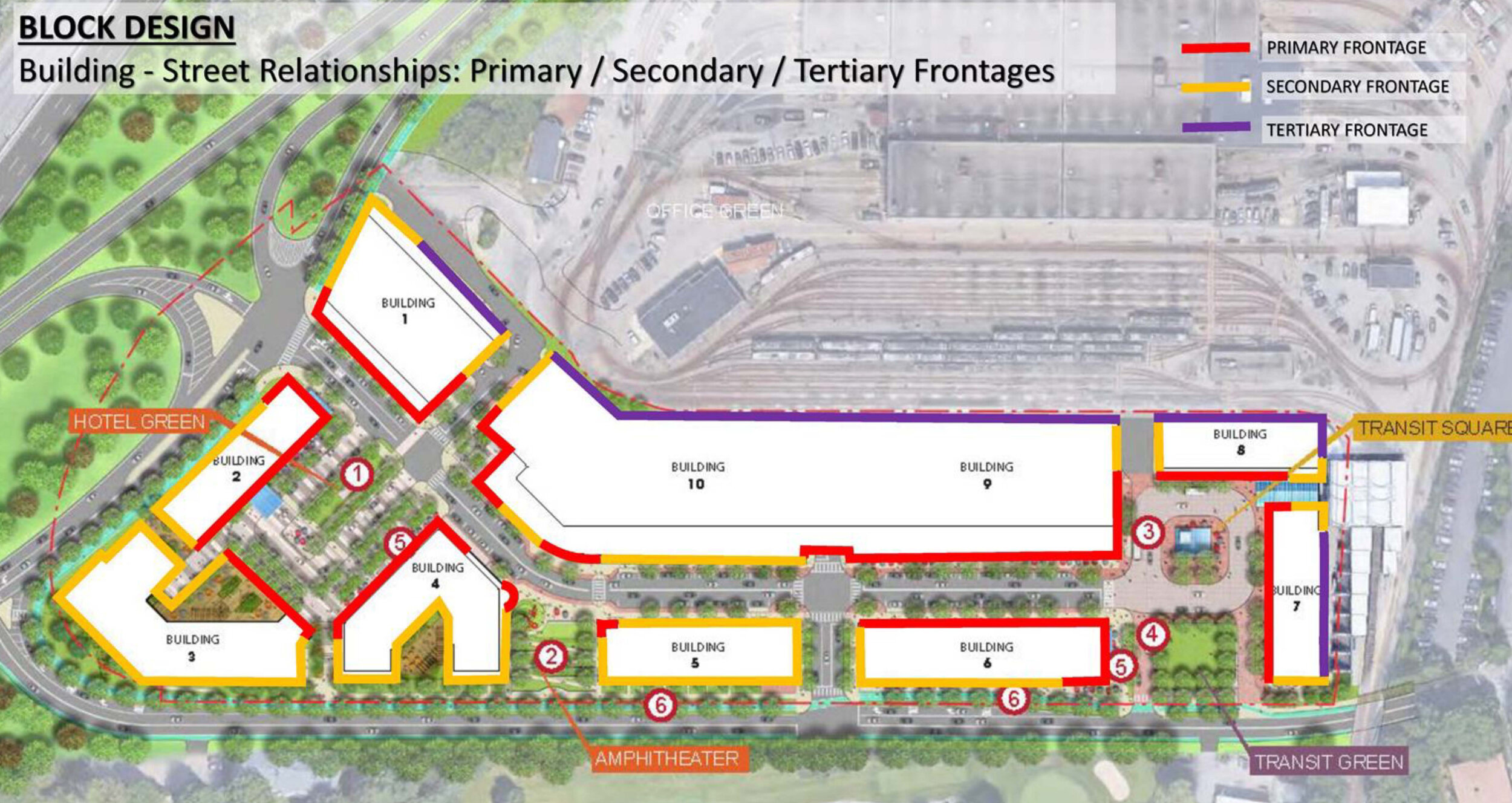
On the recently approved Riverside project in Newton, we served as part of the city’s peer review team and authored the city’s design guidelines for the development. Working with the staff, various committees and the developer [Mark Development] through an iterative process, diagramming key urban design objectives such as focal points and view corridors was a critical aspect of breaking down the complex urban qualities of the design into a legible critique and accessible guide for the city council and members of the public. The design guidelines themselves needed to function as both a roadmap for moving the project forward and a template to review the final design for consistency at the building permit stage. In these instances, diagramming is an important tool for communicating design goals and standards during a public process and within the context of a peer review.

 
Pages from 200324_Riverside_Newton_Design_Guidelines_LUC_Presentation_Page_1.jpg
 
 
Pages from 200324_Riverside_Newton_Design_Guidelines_LUC_Presentation_Page_2.jpg
 
 
Diagramming on precedent images to illustrate key guideline objectives such as storefront continuity and façade scale

Diagramming on precedent images to illustrate key guideline objectives such as storefront continuity and façade scale


Springfield Northeast Downtown District – Springfield, MA

In Springfield Massachusetts, Form + Place has been working with the city to develop a master plan for the Northeast Downtown District to put in place an urban framework that will catalyze future development. In a project area of this scale, the complexities of each street and parcel can easily get in the way of seeing the larger objectives of the effort. Diagramming street and open space hierarchies is critical to developing consensus on the focus of the master plan, which will ultimately leverage public funding to upgrade important corridors, open space, and development sites.

 
Setting the scope of the study by diagramming the main commercial and transportation spine in relation to surrounding neighborhoods

Setting the scope of the study by diagramming the main commercial and transportation spine in relation to surrounding neighborhoods


Focusing on the importance of particular design proposals supporting the larger phased master plan objectives

Focusing on the importance of particular design proposals supporting the larger phased master plan objectives


Identifying a network of key green spaces in the context of the larger city fabric

Identifying a network of key green spaces in the context of the larger city fabric


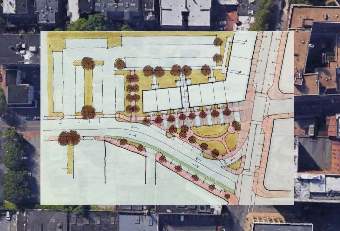
Moving into the more granular aspects of the exercise, specific public realm assets like the Apremont Triangle were re-imagined through an iterative sketch process that addressed issues of open space, traffic flow, building uses and infill opportunities. These sketches were also used as part of a three-dimensional modeling process that allowed people to visualize the proposed changes and imagine what this critical space might be like in the future.

 
Exploring the transformation of public space through the integration of unique landscape qualities and scales

Exploring the transformation of public space through the integration of unique landscape qualities and scales


Exploring more active design strategies that create a variety of types of spaces

Exploring more active design strategies that create a variety of types of spaces


Applying concepts to a 3D model of the space to better understand scale, light, urban edges and vistas

Applying concepts to a 3D model of the space to better understand scale, light, urban edges and vistas


Re-testing the initial concepts in a more fully engineered plan

Re-testing the initial concepts in a more fully engineered plan


Sketching and diagramming never really stop in the course of the design process. As buildings and parks and streets begin to take shape on paper, and the scale of the drawings gets larger and conveys more detail, sketching and diagramming the details serves to constantly clarify intent as well as articulate the finer design details. We often use a metric for judging our own design proposals that poses the following questions:

  • Does the neighborhood or district work when seen in the context of the city?

  • Does the street work when seen in the context of the neighborhood?

  • Does the building work when seen in the context of the street?

If we can keep getting to “yes” as we ask these questions throughout the process, then we know we are in good shape. If we arrive at “no”, then we go back to the drawing board.

Springfield’s Proactive Public Realm Initiatives Target Unlocking Private Investment

By Michael A. Wang

 
Rendering of a reconceived Apremont Triangle

Rendering of a reconceived Apremont Triangle


The 2012 gas explosion in Springfield’s Northeast Downtown District wiped out blocks of urban fabric in a neighborhood that was already searching for a clear identity. Strategically located between a revitalized Union Station, the Springfield Museums Quadrangle and a Main Street core that recently added the MGM Springfield casino and entertainment complex, the district has been the subject of numerous urban planning studies over the past decade.

 
Diagram showing the study area and proposed new access to the downtown

Diagram showing the study area and proposed new access to the downtown


Many of these studies have identified similar goals; promote market-rate multi-family residential development, adaptively reuse buildings of historic merit, and consider improvements to public infrastructure. Form + Place, a Newton-based architecture and planning firm, has been working with the City’s Department of Planning and Economic Development over the past nine months to develop a phased implementation plan that is truly executable. Phase One of the plan calls for targeted City investment in public realm infrastructure that will promote place-making goals and, in turn, incentivize private development dollars to follow. Ultimately, the vision imagines the addition of 1,000-1,500 new residential units, transforming the district into a thriving downtown mixed-use neighborhood.

 
Rendering of Chestnut Street as a two-way Complete Street

Rendering of Chestnut Street as a two-way Complete Street


The western edge of the district is bordered by Chestnut Street, a one-way thoroughfare that parallels Main Street, heading to the north out of the downtown. Chestnut Street has been identified in Springfield’s Complete Streets Implementation Guide as a street that should become a more prominent two-way artery. Building on previous studies, Form + Place, together with Allen & Major and in collaboration with the city’s DPW, has performed an in-depth analysis exploring the possibility of transforming Chestnut Street into a Complete Street, ripe for mixed-use development. When approaching Springfield by car from the Mass Pike, as well as I-91S, via I-291, a large percentage of traffic utilizes the Chestnut Street exit to enter the downtown. Today, due to the one-way configuration, however, the neighborhood is largely bypassed, with people trying to access to the museums, in particular, forced to take a circuitous route.

 
Aerial view of Apremont Triangle today

Aerial view of Apremont Triangle today


In addition to the opportunity to revitalize Chestnut Street into a mixed-use commercial “spine” for the district, the City plans to invest in the redesign of Apremont Triangle – an underutilized public space in the neighborhood. Form + Place’s proposal to close one of the three streets that surround the triangle, will substantially increase the size of the park, transforming it into an active and usable focal point for the area. A new green space, with enhanced sidewalks and pedestrian crossings, will provide the opportunity to accommodate everything from outdoor dining, to flexible market space to a place for entertainment and gathering.

Street level rendering of a revitalized Apremont Triangle with outdoor dining

Street level rendering of a revitalized Apremont Triangle with outdoor dining

These Phase One public investments hold tremendous potential to reshape the district and, when considered in conjunction with the City’s desire to create an additional new public park in the neighborhood, seem entirely implementable, given that they do not require onerous land purchases or takings. The increase in traffic through the district will provide greater visibility for commercial tenants and the dramatic improvements to the public realm should create the framework that attracts residential developers to invest in the area. There are already some promising signs with development entities, such as Davenport Companies, working to adaptively reuse key historic assets, including the Willys Overland building. The proximity of the district to Union Station positions it as a perfect transit-oriented development opportunity and this upfront investment by the City should go a long way towards remedying the perception of the district as having blighted, vacant lots and unsafe streets.

Despite the current challenges of COVID-19, there should certainly be a demographic that will still long for an engaging urban lifestyle in a neighborhood with easy access to transit, a range of downtown amenities at their fingertips and a newly revitalized public realm consisting of Complete Streets and flexible open spaces.

 
Future infill development completing a mixed-use Chestnut Street corridor

Future infill development completing a mixed-use Chestnut Street corridor


Rebuilding Trust: Public Space as Common Ground

By Aidan Coleman

The pandemic has drastically altered society by restricting gatherings, resulting in people flocking to the internet and socializing behind screens. While technology has risen to the occasion to help fill the social void, there’s no question that this widespread shift to online communication has been disruptive and has forced people to adjust. In addition to the mental stresses of the pandemic, civil rights issues and politics have caused a general fear and distrust of those who are unfamiliar. In response, beyond the necessary public realm changes for health protocols, designers must work to create public platforms that will foster rebuilding of trusting relationships in our communities.

Public space programmed to allow for active, face-to-face interactions

Public space programmed to allow for active, face-to-face interactions

With the pandemic forcing society to adapt to online communication, we are left largely isolated within our closest social circles. It doesn’t take much experience being online to know that being stuck behind screens all day has negative impacts on our mental health, but there have also been studies on the effects of technology on the human psyche - Dr. Helen Riess is a psychologist who has recently released a book called The Empathy Effect, which describes how the increased communication through text on the internet can damage our ability to feel empathy due to the fact that we can’t see facial gestures or voice tones that should go with our words (Street Roots). It’s no surprise that our dependence on the internet and social media has led to countless misunderstandings that often lead to hostility. The way we, as designers, can catalyze face-to-face interactions is with architecture and programming. Andreea Cutieru describes from her ArchDaily article:

“Social capital refers to the relationships established between social groups in heterogeneous societies, through shared values, trust and reciprocity. Substantial social capital means increased cooperation among citizens, less friction and a keen awareness of the common grounds and entwined fates. Architecture can help build social capital, and numerous design strategies can generate fertile ground for social interaction and various unplanned activities.” (The Architecture of Social Interaction)

While we can’t force people to interact, architecture, with proper programming of the spaces, can provide attractive gathering places that allow people to participate in shared experiences with one another, ultimately encouraging healthy communication.

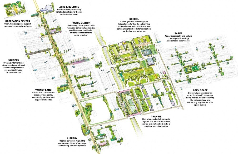
Studio Gang is an architecture firm that explores many projects and ideas that intertwine architecture and planning with building relationships within a community. They released a booklet in 2016 called Civic Commons that discusses methods for cities to activate their common spaces, and it’s apparent that we need this type of urban planning and design more than ever in 2020. The booklet runs through how to evolve seven types of urban gathering spaces (libraries, parks, rec centers, police stations, schools streets and transit stations) by creating open and comfortable spaces for the community to have diverse experiences while they socialize, work, learn, play, or deliberate. To achieve the goal of trusting others in our community and beyond, we must reshape our urban spaces to allow for comfort and diversity in shared experiences as people come together face-to-face.

Civic Commons Master Plan Graphic, by Studio Gang

Civic Commons Master Plan Graphic, by Studio Gang

While evolving civic spaces may seem like a long-term goal that can only be realized after people can gather safely, efforts to transform our environment are already occurring in real time through social distancing. The outdoor realm is being utilized in the practice of tactical urbanism. Pop-up furniture and boundaries reshaped the streets, and in our previous blog on Streetscapes, F+P discussed how easily these temporary street markers could be implemented permanently, allocating more space for pedestrian activity, as opposed to the automobile.

 
Outdoor dining is a must in our current environment, filling street space with attractive ambiance. Photo by Aidan Coleman

Outdoor dining is a must in our current environment, filling street space with attractive ambiance. Photo by Aidan Coleman


Reorganizing cityscapes for pedestrians is only the first step in evolving our urban spaces to improve public physical and mental health. An important next step in sparking community collaboration and shared experiences is through programming. Even while social distancing, tactical urbanism can be used to block out stage and viewing spaces for performances. When Italy was in lockdown, their viral videos of musicians playing and singing out of their apartment balconies for everyone stuck inside were an uplifting sight. Public art can be a way to bring vibrancy to an otherwise lackluster environment. Vendors can spread out into outdoor pedestrian space to allow for interactive display experiences. Eventually, participation in games/ sports in our larger pedestrian urban environments will literally bring people together. There is even a new movement in urban areas called “guerilla gardening” where individuals take advantage of underutilized spaces and plant varieties of greenery to enliven the area.

 
Dynamic pedestrian spaces created with multiple layers of design elements. Photo by Aidan Coleman

Dynamic pedestrian spaces created with multiple layers of design elements. Photo by Aidan Coleman


While we have been able to temporarily reshape urban areas to make public life work with social distancing for physical health purposes, our social and mental health have taken a back seat. This year has made clear that these issues are also of great importance. As we weather this pandemic, we must design for rebuilding community trust, promoting spaces that offer common ground between strangers for a variety of goals and collaborations.

Sources and Inspirations

  • “Civic Commons.” Studio Gang, studiogang.com/project/civic-commons.

  • Cutieru, Andreea. “The Architecture of Social Interaction.” ArchDaily, ArchDaily, 7 Aug. 2020, www.archdaily.com/945172/the-architecture-of-social-interaction.

  • Green, Emily. “How Technology Is Harming Our Ability to Feel Empathy.” Street Roots, Street Roots, 20 Feb. 2019, www.streetroots.org/news/2019/02/15/how-technology-harming-our-ability-feel-empathy.

  • “Polis Station.” Studio Gang, studiogang.com/project/polis-station.

  • Zilliacus, Ariana. “Studio Gang Creates 7 Strategies to Reimagine Civic Spaces As Vibrant Urban Hubs.” ArchDaily, ArchDaily, 27 Sept. 2016, www.archdaily.com/795905/studio-gang-creates-7-strategies-to-reimagine-civic-spaces-as-vibrant-urban-hubs.

The Out-Parcel Paradigm

The Dartmouth Company and National Amusements Team Up to Add Value in Warwick, RI

By John Rufo

What to do with those cinema parcels that seem underutilized? It is a question that National Amusements and The Dartmouth Company have been collaborating to address in multiple locations over the last few years. In a word, these properties can be challenging to redevelop and bring new value to. Before the mixed-use enlightenment, cinemas were often conceived of as stand-alone destinations. They were developed with two things in mind: maximizing the number of screens the market could bear and maximizing the efficiency of vehicular traffic onto and off the property.

Newly developed “out-parcel” in Warwick, RI (Photo credit: Helen Murray)

Newly developed “out-parcel” in Warwick, RI (Photo credit: Helen Murray)

In this single-minded paradigm, the edges of the site were kept clear to allow for unobstructed sightlines to the cinema and the marquis displaying the names of current movie offerings. So many things have changed in the way that Americans consume entertainment now. With a multitude of media entertainment options, the dwindling cinema profits force a reconsideration of the value of the underlying real estate. While these parcels, on the whole, may be difficult to completely redevelop, the strength of these sites are that they typically have great locations and great visibility.

Aerial view of project site, Warwick, RI

Aerial view of project site, Warwick, RI

The Showcase Cinema site in Warwick, RI is one such site with easy access at the confluence of I-95 and Route 4 and a neighborhood of commercial and institutional properties ranging from strip retail to medical office parks to the New England Institute of Technology. The easy access and the bustling context make the value of fast casual food, coffee, and boutique fitness a bit of a no-brainer as a development program augmenting the anchoring cinema.

Project site in early stage of construction

Project site in early stage of construction

Retail design in this context is driven by visibility, identity, and convenience. The design of the building itself is primarily about bracketing and giving focus to the street-facing facades and critical corners looking up and down the main thoroughfare. Each retailer is given a distinct façade element to call their own. We often distinguish these elements from each other with the use of different finish materials and a variety of architectural features such as cornices, piers, canopies, and wrap-around glazing. While we stay flexible in how we deploy the materials and color palette, the alternating values of the main façade elements give strong visual separation between tenants.

Photo credit: Helen Murray

Photo credit: Helen Murray

In the case of the new 6,800 sf building at Warwick, a material palette of EIFS, fiber cement, cultured stone, and clear anodized aluminum storefront give a distinctly modern identity to each tenant while presenting high levels of contrast with tenant signage and surrounding site features.

Architectural rendering

Architectural rendering

Completed project (Photo credit: Helen Murray)

Completed project (Photo credit: Helen Murray)

As retail consultants and developers like the Dartmouth Company continue to team with cinema operators and owners like National Amusements in a shaky retail market, easily accessible sites with great visibility will be viable for redevelopment. One final component that is key to these types of retail “out-parcel” developments is the potential for the inclusion of a drive through window. The larger cinema sites can typically accommodate this, and in our current world of hyper vigilance for hygiene and distancing, drive through services will certainly be emphasized moving forward.